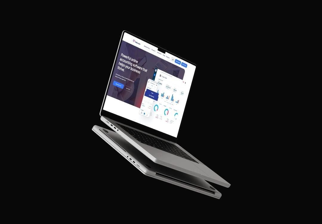
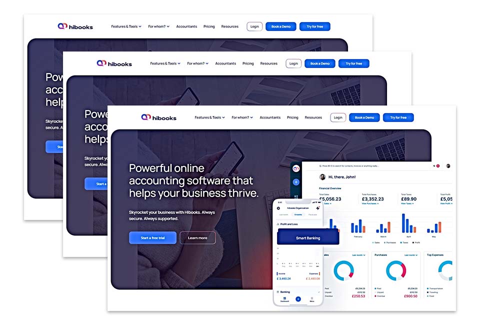
By redesigning onboarding from 27 steps to 6, we removed activation friction and accelerated user adoption.

Hi-Books is an AI-powered accounting platform built for finance teams and accountants who demand speed, accuracy, and automation. The product capability was strong, but onboarding complexity was slowing activation and delaying value realisation.
New users were required to complete 27 steps before experiencing meaningful product value. In a product-led growth motion, that friction represented a material risk to activation, retention, and downstream expansion.
Arise GTM was engaged to redesign Hi-Books’ onboarding through a PLG lens, compressing time-to-value while preserving the depth of the platform.
The result was a 77% reduction in time-to-value, achieved by simplifying onboarding from 27 steps to 6.
For PLG products, onboarding is the growth engine.
In Hi-Books’ case, the engine was misfiring.
The core challenges were:
Each additional step before the value increased the probability of drop-off. The product wasn’t failing — the path to value was.

The turning point was reframing onboarding as a revenue and activation problem, not a UX one.
By separating value-critical steps from configuration-heavy steps, it became clear that the majority of onboarding actions could, and should be deferred.
Only 6 steps were required for users to:
Everything else could wait.
We audited the entire onboarding flow and categorised each step into:
This exposed how much friction was being imposed before users reached their first meaningful outcome.
The onboarding was rebuilt to prioritise:
Steps that did not directly contribute to early value were moved out of the critical path.
Instead of locking users into a linear checklist:
This aligned onboarding to how users actually explore products — not how internal teams assume they should.
The redesigned onboarding:
The system now works with user intent, not against it. Which is a common mistake among early-stage platforms.
Hi-Books now delivers value before complexity — a prerequisite for sustainable PLG growth.
If you’re a:
This case study demonstrates how small architectural decisions in onboarding create outsized impact on growth metrics.
Onboarding isn’t a UX flow.
It’s your first revenue lever.
If your onboarding slows activation or hides value behind configuration, Arise GTM will help you redesign the path to value — not just the interface.